User Guide
Explore the costs and harms of substance use in Canada and create customized charts and tables
version 2.0
There are four categories of costs and harms data in the tool. Each category has different outcomes available:
Categories |
Health
|
Lost Productivity
|
Criminal Justice
|
Other
|
---|---|---|---|---|
Outcome |
|
|
|
|
There is also a total costs category that is the sum of all four study categories (health, lost productivity, criminal justice, and other costs).
Total Costs |
---|
Sum of all health + All lost productivity + All criminal justice + All other |
Costs | Counts and Rates |
---|---|
|
|
Within any of the outcomes, you can then explore by:
For some1 harms and costs outcomes you can also explore by the variables:
1 Age, sex and health condition data available for inpatient hospitalizations, day surgeries, deaths and potential years of productive life lost. Age and sex data available for emergency department visits, physician time, and long-term disability.
See pages 31–35 for a full listing of data available in the tool.
Due to methodological improvements, the 2015–2017 estimates should not be directly compared to estimates for 2007–2014 in the archived database. The two most notable improvements are as follows:
Data for years 2007–2014 will be updated with these improvements and made available in the online data visualization tool in the near future.
For a detailed description of methodological improvements, refer to the CSUCH technical report.
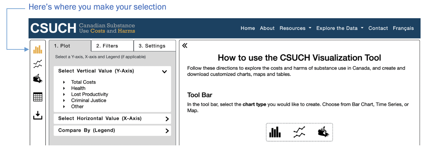
Type | Icon | Function |
---|---|---|
Chart or table options |
|
Bar chart: presents categorical data by using rectangular bars with heights or lengths proportional to the values that they represent. In this tool, you can create side-by-side or stacked bar graphs when looking at multiple variables. |
|
Time series: presents the value of an outcome over time so your x axis will be the years 2015–2017. |
|
|
Map of Canada: presents one selected outcome (cost or count/rate) using different shading in the provinces and territories to indicate the average of that outcome in the region. Users can hover over the map to see values for each province or territory. In this tool, you can use the play button to animate the map and see any changes to the values over time. |
|
|
Table: presents the data for your selected outcome as numerical values. |
|
User Controls |
|
Export: download the chart or table. The tool will provide a list of file formats available. Users have the option to select “Remember for this session” to save your preferred file type and not be prompted again during the same visit. |
|
Definitions: toggle this icon to access definitions. |
|
|
User Guide: access the user guide for more resources on how to use this tool by selecting this icon. The user guide will open in a new window. |
|
|
Reset: selecting this icon will reset the tool. Alternatively, you can reload the page using your browser reload button. |
The tool allows users to explore the costs and harms of substance use in Canada, and create and download customized charts, maps and tables.
First, select the type of chart you would like to create. The default setting is a bar chart.
Next, there are three tabs in the user interface tray you can use to build, filter and customize your charts, maps and tables. The following steps are common across chart types:
Step 6: Export, refresh and start again.
Hints
Use "Select All" in the drop down menu to both select and de-select the full list.
Creating a stacked bar chart to show the total cost of substance use by substance and cost category in 2017.
Example 1 | |
---|---|
Chart type | Bar |
Outcome of interest – vertical value (y-axis) | Total Costs > Total ($) |
Horizontal value | Substance |
Compare by (Legend) | Cost categories |
Filters | Year: 2017 (by default) |
Step 1: In “Plot” tab, select Total Costs > Total ($) as your Vertical Value.
Step 2: In “Plot” tab, select Substance as your Horizontal Value.
Step 3: In “Plot” tab, select Cost categories as your Compare By (Legend) value.
Step 4: In “Filters” tab, ensure 2017 is selected for Year.
Step 5: In “Settings” tab, select “Stack Bars”
Step 6: Download as a PDF
You will be prompted to select a file format for your download. Please select from the available options and see the explanation below your selection.
Save your PDF for use!
Use the reset button to reload your browser and start a new chart.
Please download the User Guide (PDF) for detailed instructions and screenshots.
Creating a time series to show substance use attributable total number of deaths by province and downloading the data as both a graph and table.
Example 2 | |
---|---|
Chart type | Time series |
Outcome of interest – vertical value (y-axis) | Health > Deaths > Counts and Rates > Total counts |
Horizontal value | Year (time series are always over years) |
Compare by (Legend) | Provinces |
Filters | None |
First, select “Time Series” as your chart type.
Step 1: In “Plot” tab, select Health > Deaths > Counts and Rates > Total Counts.
Step 2: In a time series, the x-axis is locked to years so there’s no need to make a selection for the horizontal value.
Step 3: In “Plot” tab, select Province/Territory as your Compare By (Legend) value.
Step 4: There are no filters to select in this example.
Step 5: There is no further customization in the “Settings” tab in this example.
Step 6: Download the data as both a graph and a data table. The first step is to download the graph.
Next, to view the data table select table from the chart options.
Select the XLSX file format to download for Excel.
Reload your browser or refresh the tool page to start a new chart.
Please download the User Guide (PDF) for detailed instructions and screenshots.
Creating a map to show standardized rate of inpatient hospitalizations for alcohol across the provinces and territories.
Example 3 | |
---|---|
Chart type | Map of Canada |
Outcome of interest – vertical value (y-axis) | Health > Inpatient hospitalizations > Counts and rates > standardized rates |
Horizontal value | N/A |
Compare by (Legend) | N/A |
Filters | Alcohol |
First, select Map of Canada as your chart type.
Step 1: In “Plot” tab, select Health > Inpatient hospitalizations > Counts and rates > Standardized rates.
Step 2: N/A (No Compared By/Horizontal Value).
Step 3: N/A (No Filters).
Step 4: In the “Filters” tab, select Alcohol from the substance drop down options. Please note you can only filter by one option for each of the variables (i.e., only one substance or only one health condition at a time).
Step 5: In the “Settings” tab, select your desired colour and number of breaks in the data under intervals.
Step 6: Download the map for 2017 as a JPG.
Save image for future use!
Reload your browser or refresh the tool page to start a new chart.
Please download the User Guide (PDF) for detailed instructions and screenshots.
Exploring per capita costs of inpatient hospitalizations by province/territory to see:
Example 4 | |
---|---|
Chart type | Bar |
Outcome of interest – vertical value (y-axis) | Health > Inpatient hospitalizations > Costs > Per capita |
Horizontal value | Provinces/Territory |
Compare by (Legend) |
|
Filters | Year: 2017 (by default) |
First, select “Bar Chart” as your chart type.
Step 1: In “Plot” tab, select Health > Inpatient hospitalizations > Costs > Per capita ($)
Step 2: In the “Plot” tab, select Province/Territory as your Horizontal Value
Step 3:
Please download the User Guide (PDF) for detailed instructions and screenshots.
Comparing per total lost productivity per capita costs from in Ontario vs. Quebec for alcohol, tobacco and opioids from 2015–2017.
Example 5 (Ontario) | |
---|---|
Chart type | Time Series |
Outcome of interest – vertical value (y-axis) | Lost Productivity > All lost productivity > costs > Per capita |
Horizontal value | Locked to year |
Compare by (Legend) | Substance > Alcohol, tobacco |
Filters | Ontario |
Example 5 (Quebec) | |
---|---|
Chart type | Time Series |
Outcome of interest – vertical value (y-axis) | Lost Productivity > All lost productivity > costs > Per capita |
Horizontal value | Locked to year |
Compare by (Legend) | Substance > Alcohol, tobacco |
Filters | Quebec |
First, select “Time Series” as your chart type.
Step 1: In the “Plot” tab, select Lost Productivity>All lost productivity>Costs>Per capita ($).
Step 2: In a time series, the x-axis is locked to years so there is no need to make a selection for the horizontal value.
Step 3: In the “Plot” tab, select Substance and check Alcohol and Tobacco from the options.
Step 4: In the “Filters” tab, select Ontario.
Step 5: In the “Settings” tab, select ‘Lock Y-Axis’.
Step 6: Download as a JPG and insert into a Word document to create a side-by-side comparison.
Now, create the second chart (ensuring the y-axis is locked) and only changing the filter option from Ontario to Quebec.
Step 7: Download as a JPG to compare to the first graph in the example.
Now you have two graphs to compare side-by-side. You can also open multiple tabs to compare across graphs.
Please download the User Guide (PDF) for detailed instructions and screenshots.